My Work
Social Media Content
Kroger Content Sample – Instagram
This mock Instagram post was created as part of my Creative Strategies in Advertising class at Xavier University. The intention of this post was to inspire viewers to shop at Kroger by showing them delicious food they can make with ingredients from Kroger.
Harriet Beecher Stowe House – Facebook
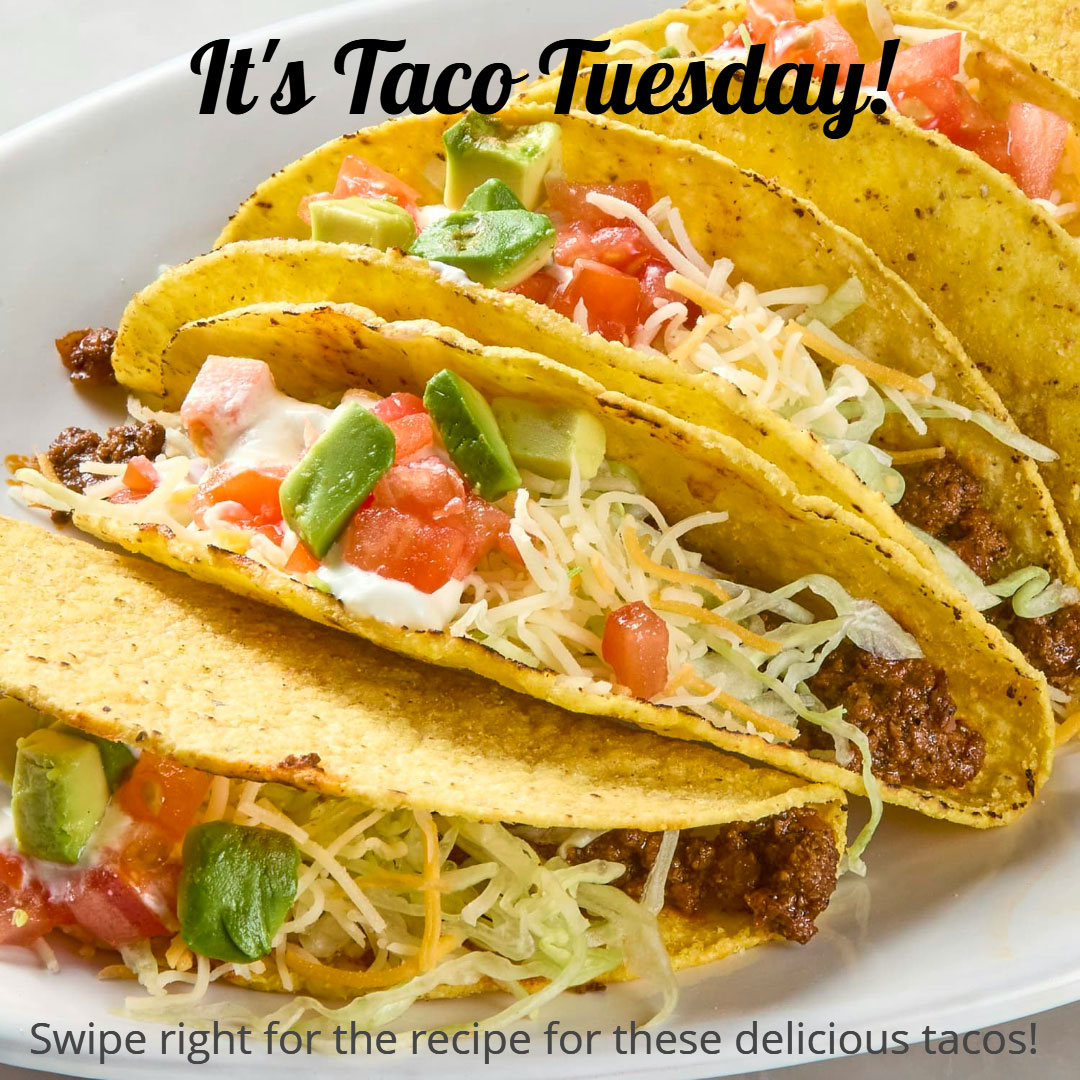
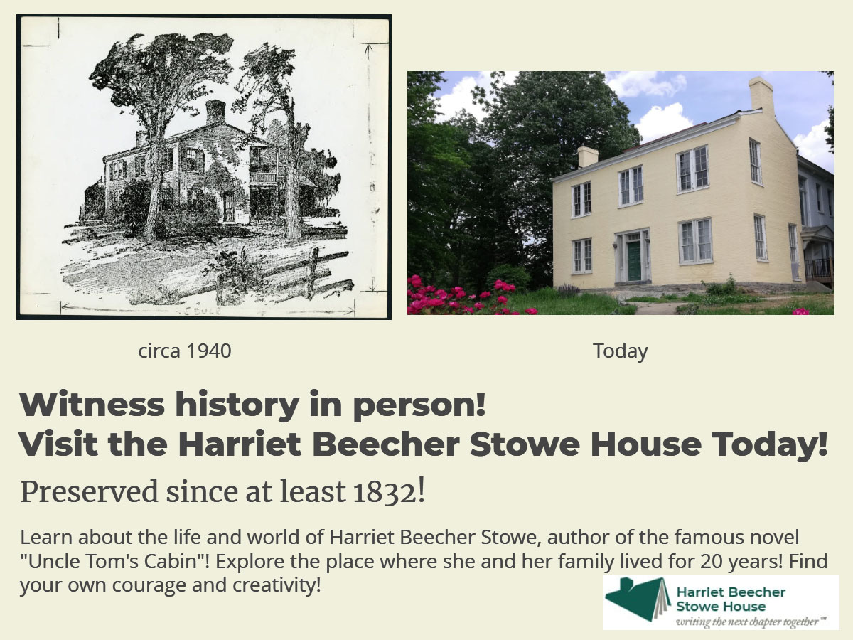
This mock Facebook post was created as part of a final group project for my Social Media Strategies class at Xavier University. For this project, my group collaborated with the staff from the Harriet Beecher Stowe House, a historical site in Cincinnati, Ohio. Our goal was to revitalize the House’s social media strategy to drive more online engagement and increase visits to the house.
This mock post is meant to reach older users and users with families to inspire them to visit the Harriet Beecher Stowe House.
Harriet Beecher Stowe House – Instagram
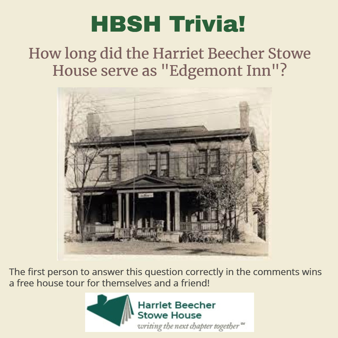
This mock Instagram post was also created as part of the final group project for the Harriet Beecher Stowe House.
Since Instagram is generally used by younger audiences, my group and I felt the best way to gather engagement would be to create a contest. Since everyone likes winning prizes, we believed this format would attract the most likes and comments.
Ben & Jerry’s Social Media Post
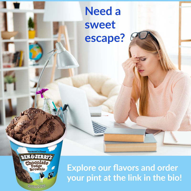
This is a mock social media advertisement that I created using Adobe InDesign.
As part of the overall project for my Creative Strategies in Advertising class, I was tasked with choosing a company, designing an advertising campaign from scratch, and making 3 sample ads based on the designed campaign. This is one of the ads that I created for this assignment.
This ad would be posted on social media platforms popular with younger audiences such as Instagram. The idea behind it is that Ben & Jerry’s sweet, rich, flavorful ice cream satisifies the body, which makes it a good way to treat yourself and help you unwind when you need a break from studying. Thus, Ben & Jerry’s ice cream is worth spending money on.
Vizabli LinkedIn Post #1
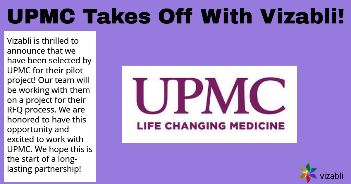
As part of my work for my previous employer, Vizabli, LLC, I was tasked with creating and uploading digital content to the company LinkedIn page daily. These posts were created in Snappa.
This post is intended to announce Vizabli’s pilot project for new, high tech hospitals rooms was accepted by UPMC.

Vizabli LinkedIn Post #2
This is another example of digital content I created to post on Vizabli’s LinkedIn page.
This post is intended to inform viewers about one of Vizabli’s core company values – active listening. It also aims to explain how active listening guides Vizabli’s work and lends itself to the company’s success.
The image in this post was created by using the image-generating AI Midjourney.
Vizabli LinkedIn Post #3
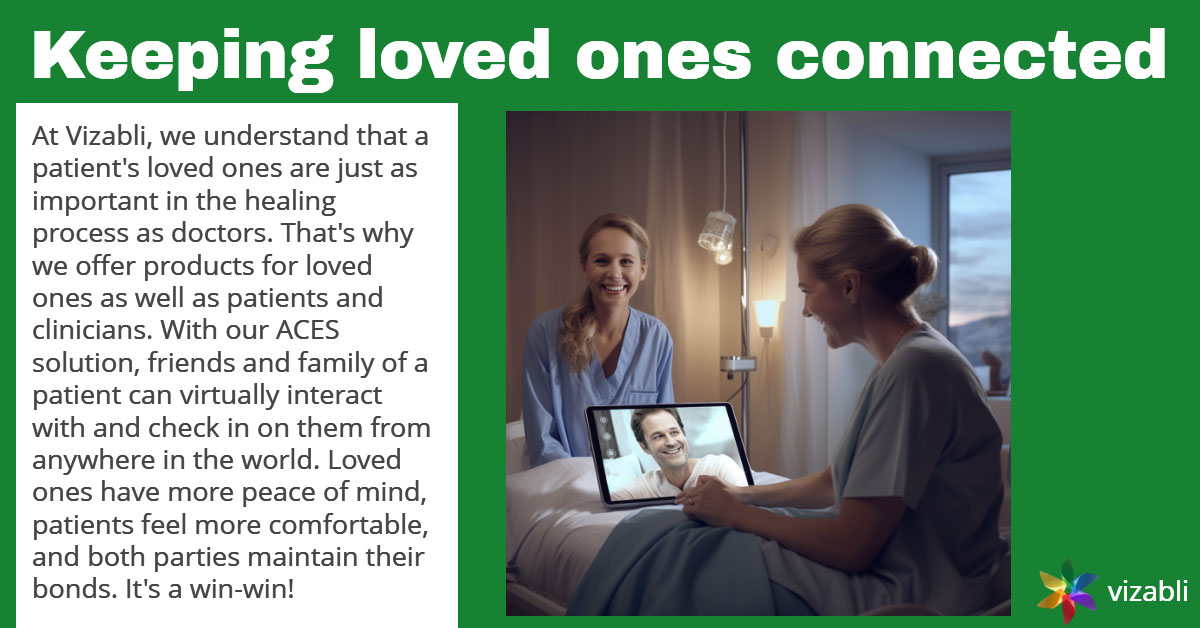
This is another example of digital content I created to post on Vizabli’s LinkedIn page.
This post is intended to inform viewers about how Vizabli’s ACES software system keeps patients connected with their loved ones while in the hospital.
The image in this post was created by using the image-generating AI Midjourney.
Vizabli LinkedIn Post #4
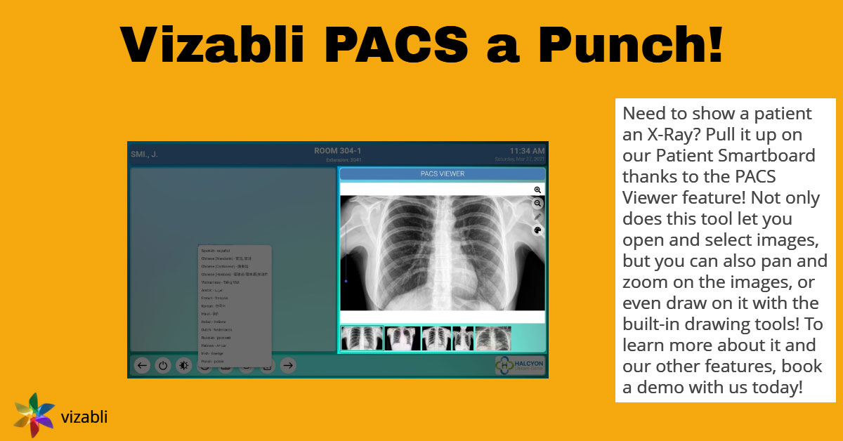
This is another example of digital content I created to post on Vizabli’s LinkedIn page.
This post is intended to inform viewers about the capabilities of Vizabli’s PACS software program. The image within the post showcases an example of what PACS can do.
The title of the post is both a pun and a play on words of the name of the software the post focuses on. I believed this attempt at humor would encourage more people to view and engage with the content.
Vizabli LinkedIn Post #5
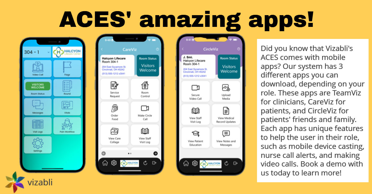
This is another example of digital content I created to post on Vizabli’s LinkedIn page.
This post is intended to inform viewers about the three apps Vizabli made to go along with their ACES software system. It gives the viewer a short summary of differentiates the three apps from each other and lists a few examples of what the apps can do.
The title of the post is purposefully using alliteration. I believed this experiment with sound would encourage more people to view and engage with the content.
Vizabli LinkedIn Post #6
This is another example of digital content I created to post on Vizabli’s LinkedIn page.
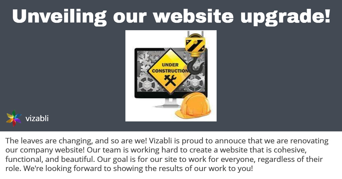
This post is intended to announce the remodel of Vizabli’s company website to viewers. We wanted to inform our followers that we would be building a functional, well-designed website that would be accessible for a variety of visitors.
This post was never published because the website project was put on hold.
Vizabli LinkedIn Post #7
This is another example of digital content I created to post on Vizabli’s LinkedIn page.
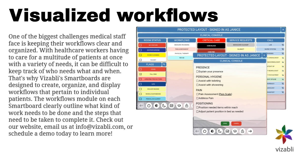
This post is intended to inform viewers about the visualized workflows feature of the ACES system. We wanted to inform our followers about how this element worked and interacted with the Smartboard hardware and ACES software of Vizabli’s solution. We also intended to explain to viewers how visualized workflows made work easier for hospital staff.
Vizabli LinkedIn Post #8
This is another example of digital content I created to post on Vizabli’s LinkedIn page.
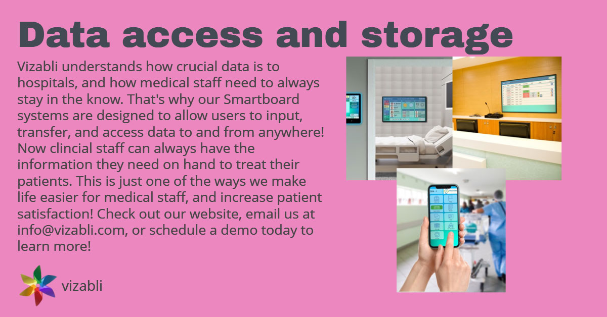
This post is intended to inform viewers about the data access and storage feature of the ACES system. We wanted to inform our followers about the key component of this feature, and explain to viewers how it made work easier for hospital staff.
Vizabli LinkedIn Post #9
This is another example of digital content I created to post on Vizabli’s LinkedIn page.
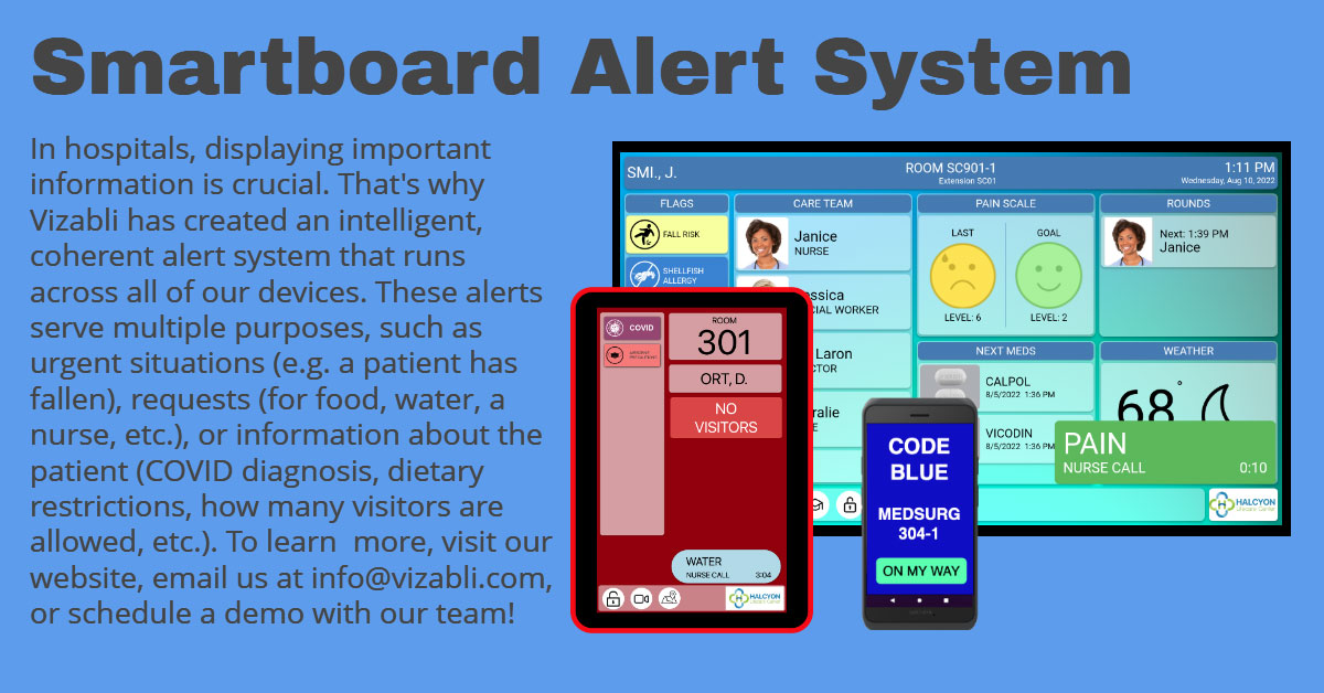
This post is intended to inform viewers about the Smartboard Alert System feature of the ACES system. We wanted to inform our followers about the different kinds of alerts this element can display to help them understand how it works and makes it easier to share critical information.
Vizabli LinkedIn Post #10
This is another example of digital content I created to post on Vizabli’s LinkedIn page.
As part of the social media content calendar that I created for Vizabli, the theme for weekly Tuesday posts was “Team-up Tuesday”, where we highlighted one of our partner companies. This post is intended to spotlight Fairchild Communication Systems, Inc., one of our distributors. We wanted to thank Fairchild for their loyalty and the work they do for us, as well as inform our followers about partnership with Fairchild in hopes of increasing connections.
This post was never published because the idea was repeatedly scrapped for other ideas.
Ads On Other Mediums

Ben & Jerry’s Billboard Ad
This is a mock billboard advertisement that I created using Adobe InDesign.
As part of the overall project for my Creative Strategies in Advertising class, I was tasked with choosing a company, designing an advertising campaign from scratch, and making 3 sample ads based on the designed campaign. This is one of the ads that I created for this assignment.
This ad would be posted on billboards near office buildings and in city business districts. The idea behind it is that office workers would see the billboard while they are working or on their way out of work, and be inspired to buy a pint of Ben & Jerry’s ice cream to treat themselves after working all day. Ben & Jerry’s sweet, rich, flavorful ice cream satisfies the body and creates pleasure, helping you unwind. So, Ben & Jerry’s ice cream is worth spending money on after an exhausting work day.
Ben & Jerry’s Print Ad
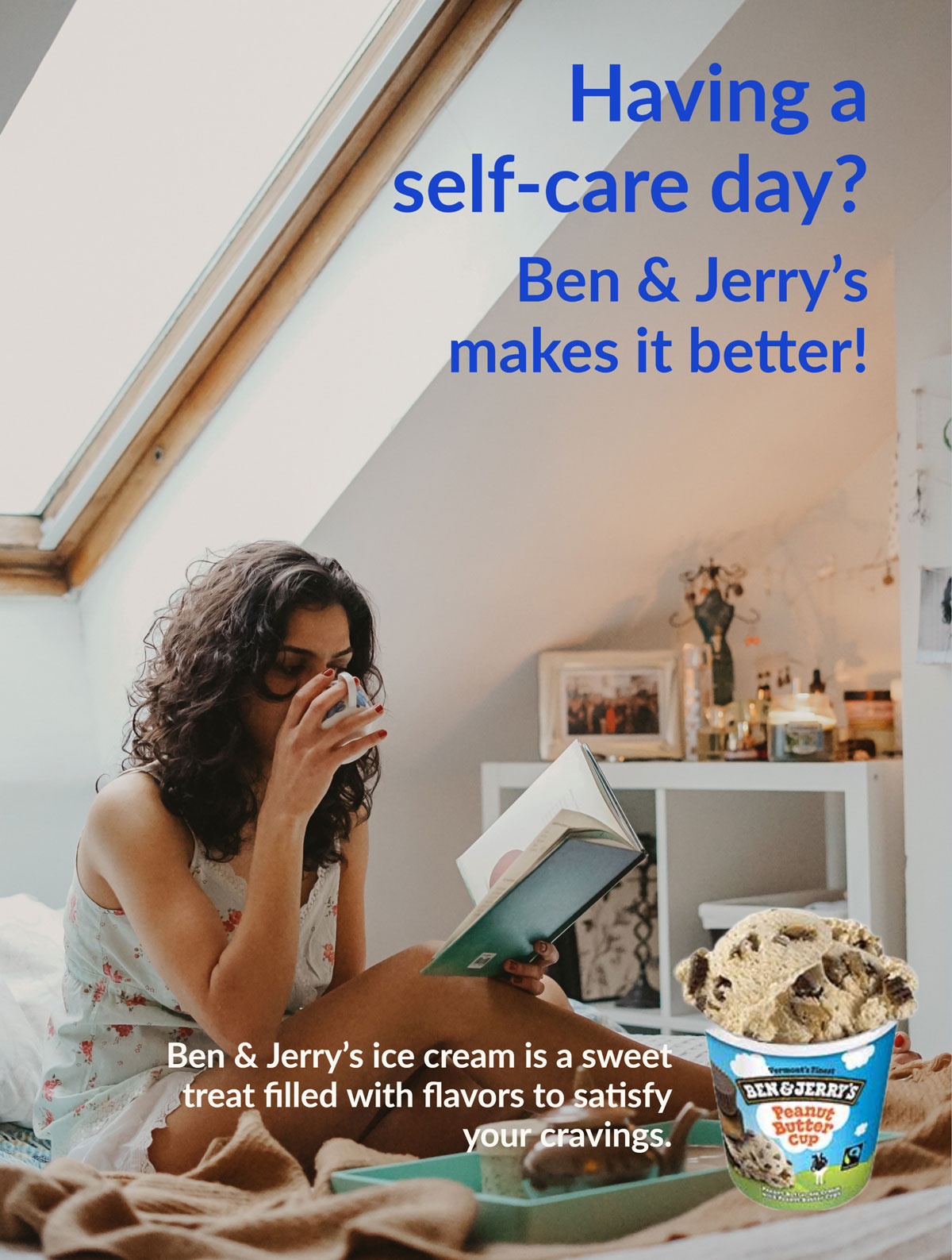
This is a mock print advertisement that I created using Adobe InDesign.
As part of the overall project for my Creative Strategies in Advertising class, I was tasked with choosing a company, designing an advertising campaign from scratch, and making 3 sample ads based on the designed campaign. This is one of the ads that I created for this assignment.
This ad would be placed in magazines with large numbers of subscribers, particularly ones whose readers are primarily female. The idea behind it is that readers would spot this ad while relaxing and reading a magazine, inspiring them to buy a pint of Ben & Jerry’s ice cream to treat themselves. Ben & Jerry’s sweet, rich, flavorful ice cream satisfies the body and creates pleasure, helping you unwind. So, Ben & Jerry’s ice cream is worth spending money on to pamper yourself on a self-care day.

Kroger Billboard Ad
This is a mock billboard advertisement that I created using Snappa, an online graphic design website similar to Canva.
This ad would be posted on billboards near Kroger stores and along highways. The intention of this billboard is to get consumers aware of this great deal Kroger is offering and encourage them to come to the store to buy apples. While shopping at Kroger, they can also see what other goods are on sale.
The headline of this billboard is meant to be a pun, since this mock billboard was made in the fall, and apples are freshest in fall.
Kroger Digital Sidebar Ad
This is a mock digital advertisement that I created using Snappa, an online graphic design website similar to Canva.
This ad would be posted on the side of webpages of websites that are popular in areas with Kroger stores. Examples of these websites would include local news sites and community bulletin boards.
The intention of this ad is to make viewers aware of the online shopping and delivery features that Kroger offers. It aims to encourage the audience to try the service for themselves. The cart image is used to give the impression that the delivery of the ordered goods will be quick.
Other Media
Mock ASPCA Event Logo
This is a mock event logo that I created using Adobe Illustrator.
In one of my advertising classes during college, we were given a semester-long project of selecting a non-profit organization, planning a mock event that “they” would run, and creating various materials to promote the event. I selected the ASPCA because of my love for animals and because I was instantly able to come up with an idea for an event – a regional, spring-themed pet adoption event.
The logo I designed would’ve been used as the icon of the app for the event. This fictional app would’ve linked to the event website and provided users with all the information they needed about the event. The logo utilizes the core color scheme of the ASPCA – orange, black, and white. It features a dog and a cat to suggest what kinds of animals will be available at the adoption events.

Mock ASPCA Event Website Banner
This is a mock event website banner that I created using Adobe Photoshop.
In one of my advertising classes during college, we were given a semester-long project of selecting a non-profit organization, planning a mock event that “they” would run, and creating various materials to promote the event. I selected the ASPCA because of my love for animals and because I was instantly able to come up with an idea for an event – a regional, spring-themed pet adoption event.
This banner was used on the website for my mock ASPCA event. The banner utilizes bright, cheerful colors to catch the eye and evoke a sense of spring. It features cute dogs and cats to show what kinds of pets are available for adoption at the event it advertises, and to increase interest in the viewer.
UC Mock TAP Event Flyer
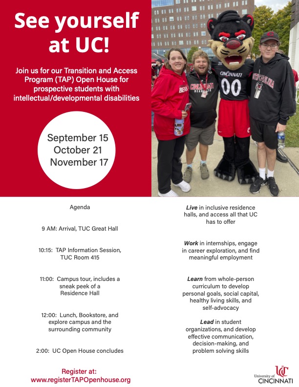
This is a mock event flyer that I created for the University of Cincinnati using Adobe Express. The fake event was an open house for UC’s Transition and Access Program (TAP), a unique program for college students with intellecutal or developmental disabilities.
To create this flyer to the best of my ability, I took a multi-step approach. First, I determined an audience and goal. My decided audience was students, their parents, and others in their support network who were looking for a guided college experience that would lead to employment opportunities and self-sufficiency. The goal was to convince people to attend the open house, but the overall message was to increase awareness of the TAP program to the specific audience who may benefit from the program.
My next step was to learn as much as I could about the TAP program. I browsed through all the university webpages I could access about TAP, taking notes along the way. I read about how the program integrates with academics and student life, the transition support and leadership opportunities they offer, and TAP’s successes.
Finally, I familiarized myself with UC’s brand guidelines. I used this information to incorporate the university-approved colors, color combinations, tone and voice, and typography into my flyer design. I then added the required flyer information and some information that I learned from my research. Doing this brought my flyer together, and I was able to show my final design to my interviewers to demonstrate my skill and creativity in design.
Video
Mock ASPCA Event Promotional Video
This is a mock promotional event video that I created using Adobe Express.
My video would be posted on the event website to promote the adoption events, convince people to adopt a pet, and provide information on the event. It would also be posted on the ASPCA website and as an advertisement on local websites in cities where adoption events were taking place.
There are multiple purposes for this video. First, it aims to encourage viewers to come to the pet adoption events. It also strives to inspire the audience to adopt a cat or a dog. And lastly, it provides information about the event. All of these ideals come together to promote the adoption events in a fun, inspiring way.
Website
Mock ASPCA Event Website
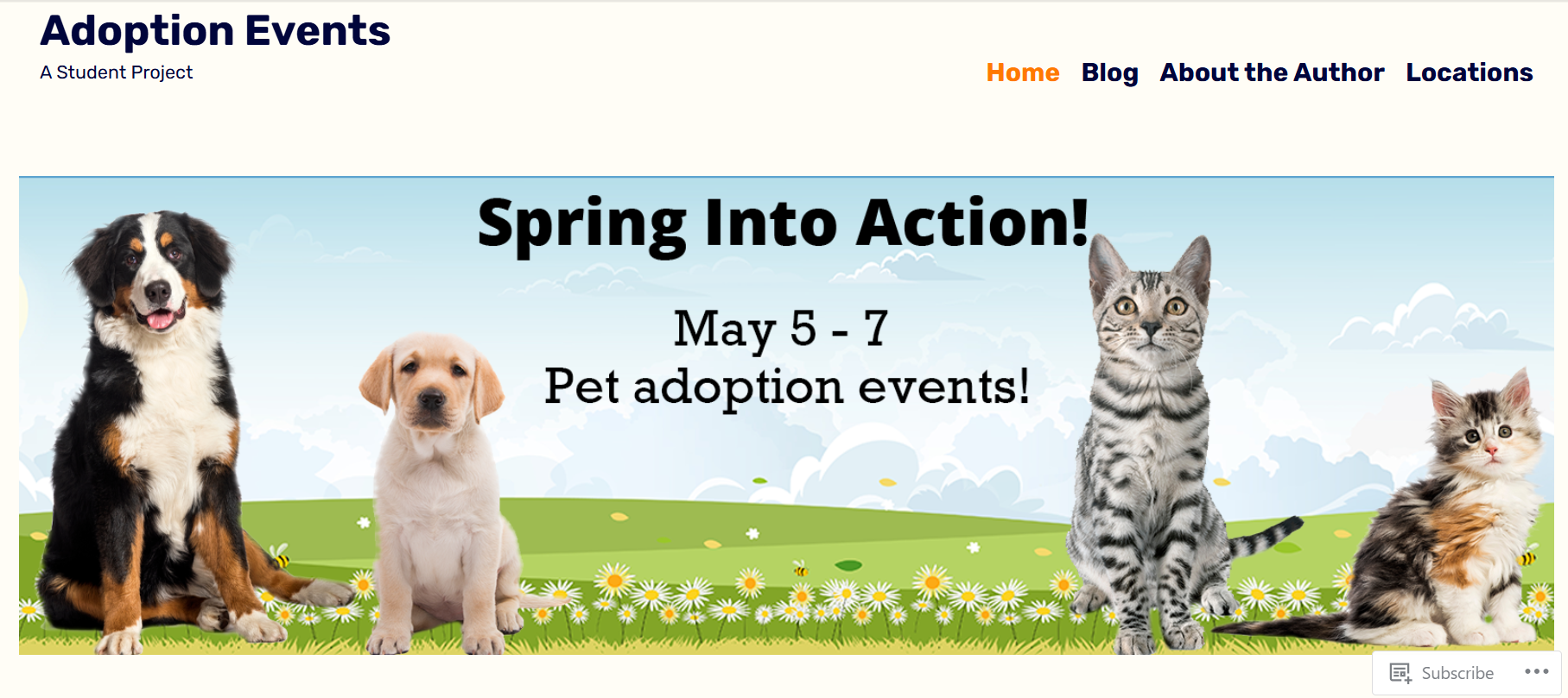
This is a mock event website that I created using WordPress.
My event website has multiple pages for users to explore. The home page contains the website banner, advertises the different kinds of cats and dogs available for adoption, and displays the event flyer and promotional video. It also contains links to the Blog and Locations pages.
The Blog page features a few blog posts I wrote and is intended to provide updates and information to people who are interested in the pet adoption events. The Locations page informs viewers where the adoptions will take place. And the About the Author page provides a picture and a bit of background information about me, as well as why I chose to focus my project on the ASPCA.
I opted to keep the design of my event website simple so that it was easy to read and navigate, making it accessible to all audiences. A wide variety of people from different backgrounds would be attending the adoption events if they were real, so I wanted to ensure all of them would be able to find and understand the information on my website. I made up for the simple design by using a variety of colors in my images and other elements.
Contact Me
mschramm513@gmail.com
Feel free to contact me with any inquiries or questions!